Nuts & Bolts: How We Visualized Our Evolving Portfolio

Since 1996, Heron has been trying to invest its portfolio in better alignment with its mission.
But enterprises can be complicated organizations with multifaceted impacts, and we realized that attempting to understand and track the social performance of our investments was a daunting process. We decided that we needed to begin by understanding what we already owned, and then move from unfavorable positions to more impact-aligned positions. With this challenge in the forefront of our minds, it became clear that we would need a way to track and visualize our progress as we examined our portfolio.
We don’t believe that we are done perfecting a system for visualizing our progress. However, we would like to share some insight into our journey thus far, and how our approach has shifted over time to result in our current -5 to +5 net contribution approach. Our hope is that others may learn from our mistakes and find what may work for their own better understanding of their investments.
The Portfolio Examination Project (PEP)
In 2014, Heron began what was internally called the Portfolio Examination Project (PEP) to better understand what we already owned. By using a combination of Bloomberg, MSCI, Cometrics, fund manager reports, and raw staff time, Heron was able to gather information across the majority of the portfolio. We found that transparency into underlying investments of private equity funds or debt portfolios can be tricky, and requires good communication and cooperation with fund managers.
At the time, Heron’s approach was heavily focused on the metric of job creation and quality. So, from here, Heron began to develop a method for scoring social performance relative to jobs for each of our investments. The 2×2 matrix below was our first attempt to visualize that focus.
The goal of this matrix was to help us map out our strategy for maximizing our portfolio for “jobs impact,” with the understanding that negative overall social performance was not a tradeoff we would be willing to accept. Therefore, we considered both jobs and overall social performance (using the MSCI ESG Intangible Value Assessment as a proxy for overall social performance), as demonstrated on the x and y axes respectively. The goal was to optimize our portfolio towards the upper right, with both a positive jobs score and positive overall social performance.
This approach demonstrated how the metrics we chose could unintentionally result in unwanted investments in our portfolio. For example, the PEP process revealed our investment in Corrections Corporation of America, which technically scored well on jobs created and passed the threshold for inclusion on the social performance scale. PEP forced us to reflect internally on the role that metrics played in our investment decisions and consider how we could be more thoughtful about holistic impact in the future.
Rotating the Portfolio
Through PEP, Heron was able to better understand what we already owned. With that information, we became better equipped to rotate our holdings toward positions that we actually wanted to own in service to our mission.
Unfortunately, we discovered relatively few truly mission-aligned, poverty-oriented investment managers in the market. But there were a growing number of impact-screened opportunities in which Heron could engage. Accepting that these impact-screened vehicles were at least more mission-aligned than our preexisting portfolio, we spent the next few years rotating over $150 million to impact-screened vehicles.
In the chart below, you can see how Heron began moving our endowment into vehicles and enterprises that were screened for impact. This is shown as a binary split of our endowment into “Not Yet Screened” and “Impact-Screened.” On December 21, 2016, Heron rotated the last unscreened piece of its corpus to a slate of impact-screened ETF, achieving the initial rotation of the portfolio.
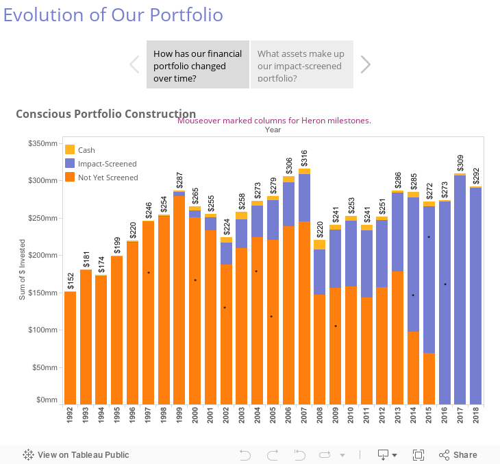
But not long after that initial rotation, an examination of our PACE bond positions led us to question the binary framework. We realized that even positions that were initially tagged as “Impact-Screened” could, over time, potentially have negative unintended consequences for the people and communities that we were chartered to serve.
The PACE experience helped us realize that it is not enough to determine if a position is considered “Impact-Screened” or not at the time of initiation, but like all investments, needed to be tracked over time. Each investment has positive and negative effects across a wide range of stakeholders, and we needed a more nuanced way to track that information as we began to optimize our portfolio to better serve our mission. We believe that optimization is a never-ending process — not only because investments are constantly changing, but also because we are always improving our methodology and learning as an organization.
Finding Data Partners & The “Net Contribution” Lens
Heron acknowledged early on that our initial PEP approach was simplistic compared to the complex reality of social impact, but it was important to stumble forward as much as possible while understanding the weaknesses of the framework.
In response to the lessons learned from our experience with CCA and PACE bonds, as well as our general desire to invest in enterprises that have a net positive impact on society, we worked with thought partners to develop the net contribution lens that we use today. We identified four types of capital that every enterprise consumes and/or produces (to varying degrees) and continue to explore potential data partners that can provide better information about each of the capitals.
The largest segment of the endowment is invested in publicly traded companies, so it was extremely important to find a data partner that had social performance data on that universe. We work with a few data providers to do so, including CSRHub, oekom, and others.
A particularly helpful metric that we often used from one of these vendors was industry-relative percentile rankings. This best-in-class type of approach helped keep comparisons consistent and accounted for inherent differences in industries. This resulted in a broadly applicable 0%-100% score that could be applied to all of our corporate holdings. (An unfortunate weakness of this initial approach was its inability to distinguish positive impact from negative impact—something we later tried to adjust for).
The Public Equity Fund graph below visualizes an account that we owned in which we were running a custom mandate. On the x-axis of the graph below, we can see the company level overall percentile rankings from 0-100% (with 0 being a proxy for poor social performance and 100 being a proxy for strong social performance). The y-axis represent how much of the fund was allocated to companies with those percentile scores.

In isolation, this information had relatively little use. So we began to look at the CSRHub scores of the commonly associated benchmarks (which, in this case, tends to be the S&P 500, seen below in a lighter color). We used the weighted average to help us get a sense of how much of the fund was allocated to higher scoring companies, relative to the benchmark.

We understand that no scores are perfect and take all data sources with a grain of salt. However, this approach allowed us to look for trends and outliers, which ultimately helped inform discussions in the space and with our managers. We used these charts to ask ourselves and our managers about the companies that fall on the low end of scores: “What is driving that low score?” “What does the data provider know that the manager does not, or vice versa?” “What companies seem to be improving or declining, and why?”
The Net Contribution Scale
In keeping with the spirit of net contribution and therefore considering the positive and negative impacts enterprises have on society, we are attempting to convert our scoring into a -5 to +5 scale. For now, the percentile scores are scaled so the average enterprise (50th percentile) receives a score of 0. Similar to the 2×2 matrix of the past, this scale is overly simplistic — however we view it as a step in the right direction.
For the remaining segments of the investment portfolio (primarily private equity and debt), we rely on our staff who work closely with the enterprises and fund manager to rate the underlying enterprises on the -5 to +5 scale using the net contribution lens. They rely on reports and calls with managers, and pull from sources such as B Analytics, Glassdoor, government agencies, and any other available information to try to determine a reasonable proxy for the net contribution of each enterprise.

We update the scores and review our investments on a quarterly basis, discussing the leaders and laggards within our portfolio and individual vehicles. The result (seen above) is something far from perfect, but very useful in keeping track of how the foundation is utilizing its assets and thinking about impact.
Heron continues to work with our current data providers, attempting to both broaden their universe of coverage as well as bring in new data sources to create more robust scores. We are always on the look-out for new and interesting data players in the space that can offer a unique perspective on how to tackle the question, “What is the net contribution of the enterprise?” As we discover new players and evolve our methodology, we will continue to find ways to visualize our progress as we pivot our portfolio towards mission.
Comments are closed here.